Sundays are for hand lettering
Kelley Lane
joie de vivre: a joy of conversation, joy of eating, joy of anything one might do… And joie de vivre may be seen as a joy of everything, a comprehensive joy, a philosophy of life, a Weltanschauung.
Use the form on the right to contact me. It will send an email directly to my inbox and then we can chat about working together!
Little Rock, AR, 72205
United States
I am a creative, specializing in Branding, Illustration, Directing, Design, Web, Print, Art, Hand Lettering and infographics.
I'm Kelley Lane, focused across branding & identity, digital and print.
For project inquiries or just to say hello, please do not hesitate to email: kelley.c.lane@gmail.com
joie de vivre: a joy of conversation, joy of eating, joy of anything one might do… And joie de vivre may be seen as a joy of everything, a comprehensive joy, a philosophy of life, a Weltanschauung.
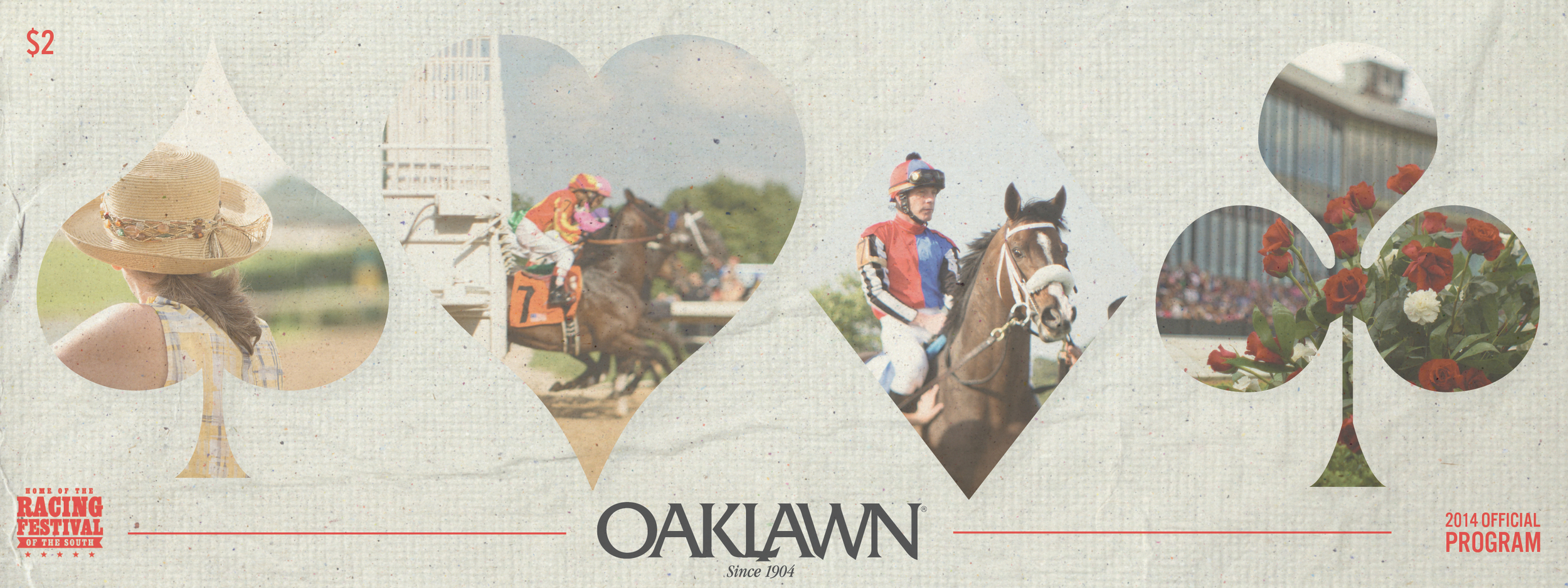
Fun to see my Oaklawn program in everyone's fist, figuring out the races.
Christ Lutheran School and Church of Little Rock, AR approached the company I run with my twin sister, Lane & Co, to help them rebrand. The 140-year-old school and church had used the same branding for at least the three preceding decades, if not longer.
In order to make the church more inviting to people in the community, they wanted to drop the "Lutheran" designation from their name . The design was a little tricky, as I wanted to keep the roots of the church but also make it more approachable to people who may not know about the denomination. I used clean, bold fonts to display the name, with a strong icon that could be used with or without the church name beneath it. I was able to tie in the Lutheran background by integrating the old Lutheran seal, dating back to 1530, with the more modern typeface. The overall goal was to create a look that will keep the church looking fresh yet holding on to traditional ties -- representing the two styles of service they hold on Sundays.
One of the old logos is below. In more recent years, multiple variations on the original logo were being used inconsistently throughout collateral.
I wanted to create an identity that would be cohesive between the church and the school, but could also stand alone as separate identities. To do this I made slight but distinct changes to the colors, but kept the bold "C" as that is the consistent part of the names between the church and school, and the Lutheran seal. While the church holds a purely blue scheme, the school identity branches out to encompass the gold and blue that represent the school's colors for athletic activities.
Here is the old logo:
Below is the new logo incorporating the seal, the "C", and the color scheme adapted to the school.
Oaklawn Racing & Gaming begins it's live season starting on Friday, January 10th!
Horse racing is one of the few momentos from the past that has been left virtually unchanged. Especially on Oaklawn's opening day -- as an homage to the inaugural year, 1904, corn beef sandwiches are sold for $0.50 and soft drinks are only $0.10!
Here are some of the recent materials I created for CJRW in preparation for the 2014 Live Season!
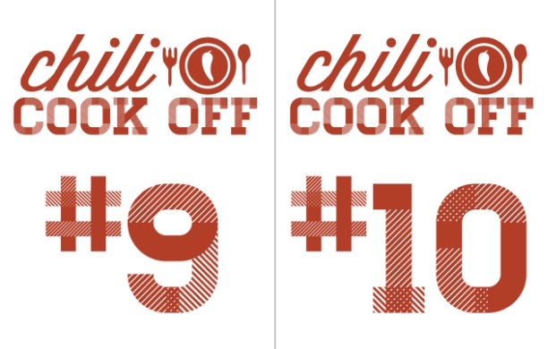
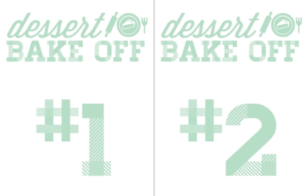
My company annually throws a large company-wide chili cook-off and dessert bake-off. I was quite excited to be the one who got to design the materials for this momentous occasion. The winner even received an engraved glass trophy. I'll have to step up my cooking game next year. That shiny glass would look swell in my office.


Christmas presents wrapped with care are twice as nice.
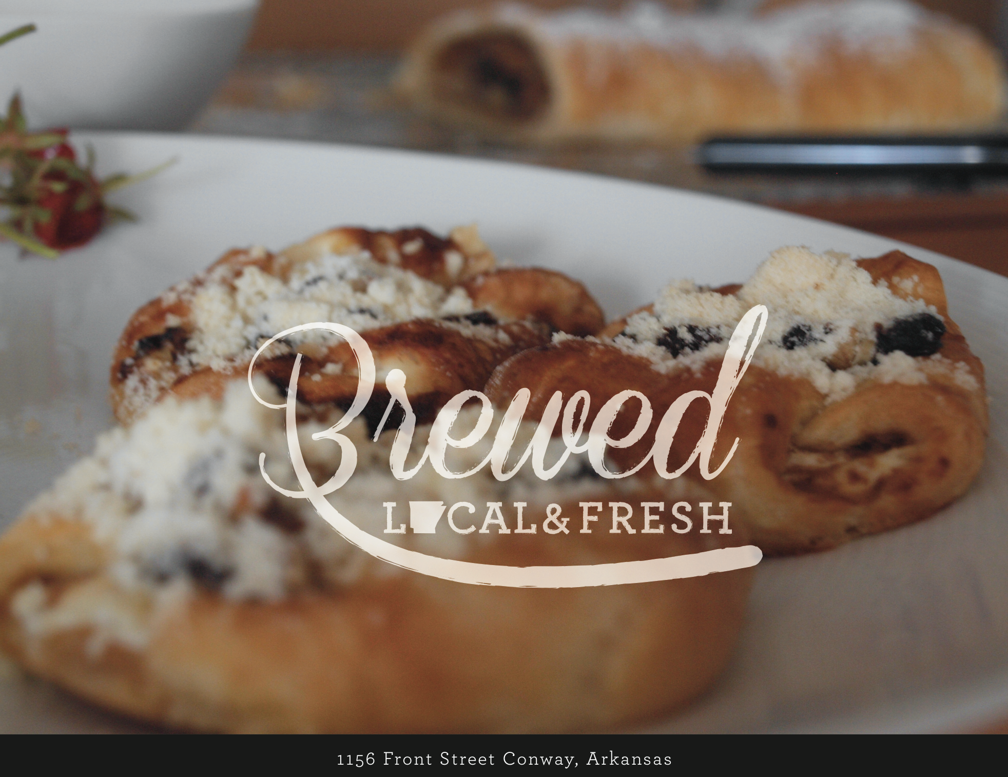
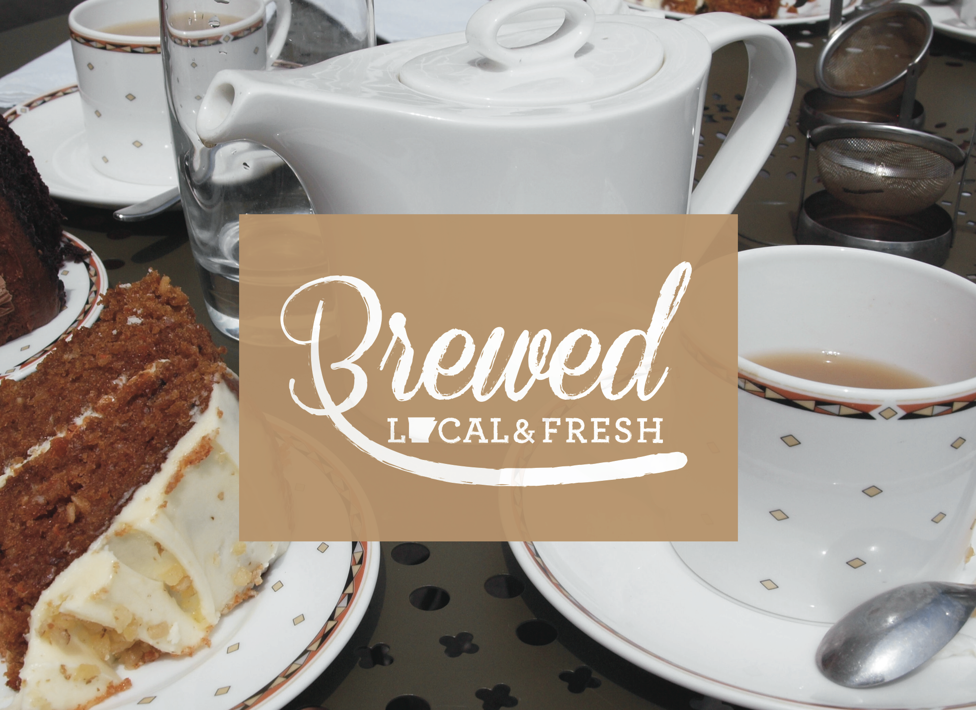
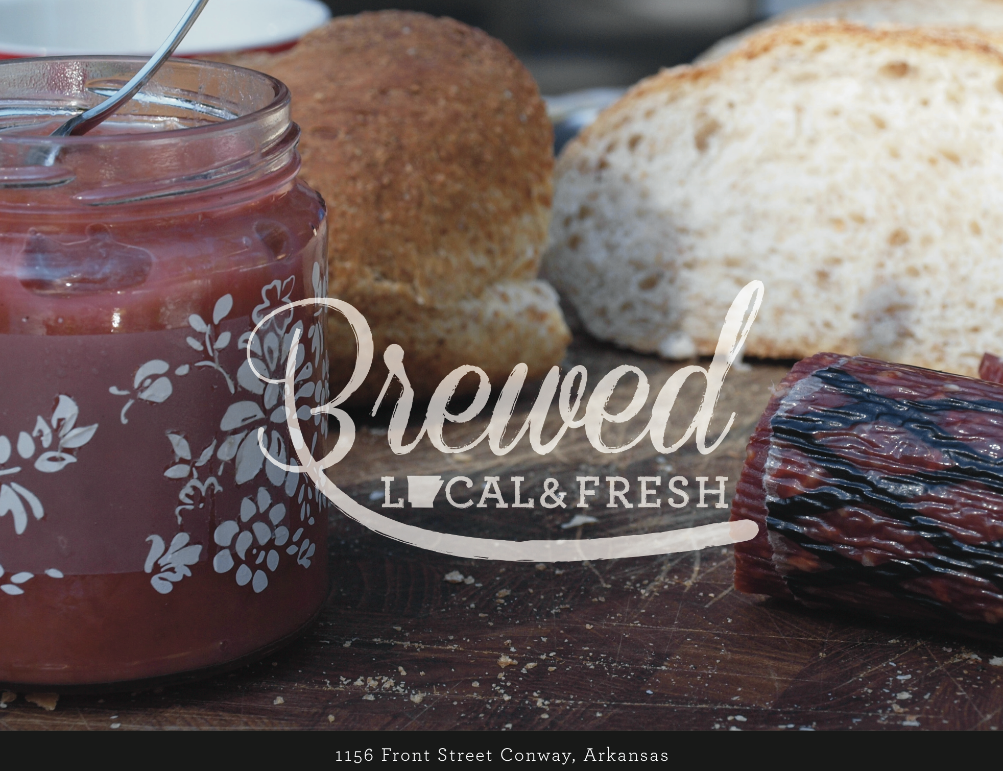
Branding for a local coffee shop & cafe in Central Arkansas.
Sketching hand lettering ideas for soon-to-be-wrapped Christmas gifts.